A photochrom print turns up in Library of Congress searches alongside hand-tinted postcards and early colour photography, and the family resemblance stops at the surface. It's an ink print pulled from a single black-and-white negative, coloured afterward by a lithographer working in a Zurich workshop who never once stood in front of the scene.
That distinction changes what's worth looking at. A sky too blue, a shadow falling the wrong way, a night that isn't quite one: these aren't printing flaws, they're the trace of a decision. Four plates carry this text — the Souk in Kairouan, the Jaffa Gate in Jerusalem, the Seven Bridges in Paris, and the Yeni Cami by moonlight in Constantinople, which we know today as Istanbul — and each one shows the mark of the process, one more plainly than the other three.
Six stones, or fifteen, and no colour survives the negative
The technique was worked out in Zurich in the 1880s by Hans Jakob Schmid, an employee of the printing house Orell Füssli. The firm produced its prints as Photochrom Zürich, distributing them under the Photoglob trade name from the mid-1890s; in the United States, it was Detroit Photographic Co. that bought the rights to the Swiss process — a story we tell at greater length in Photoglob Zürich and Detroit Publishing.
The starting point fits in one sentence: the black-and-white negative keeps no colour information at all. In the field, the photographer notes what he sees — the blue of a sky, the ochre of a wall, the colour of a bolt of cloth — and those notes are used later, back in the workshop, to transfer the image through tinted gels onto a series of lithographic stones: at least six, most often ten to fifteen, one per tint. Each stone is coated with light-sensitive bitumen, pressed against the negative, and exposed to daylight through a coloured filter; the bitumen that hardens resists the solvent, the bitumen that stays soft washes away, and the next tint is laid over the last. One stone, one pass, one decision.
What the colourist made up
Once the mechanics are clear, what stands out is the part that owes nothing to mechanics at all. The lithographer isn't painting from direct observation — he's painting from notes, from memory, sometimes from a guess. For well-documented views, the tints draw on sources already in print; elsewhere they come straight from the colourist's imagination, and the exercise slides quickly into formula — the same blues, the same ochres, recur from one plate to the next regardless of where the scene was taken. The compositions themselves get retouched too, a passerby added here, a façade nudged there, for the sake of effect; outright colouring mistakes happen as well, invisible to anyone who doesn't already know the scene.
None of this shows on the finished print. What you get is an image of photographic sharpness, carrying all the authority of a document — and it's an interpretation from start to finish.
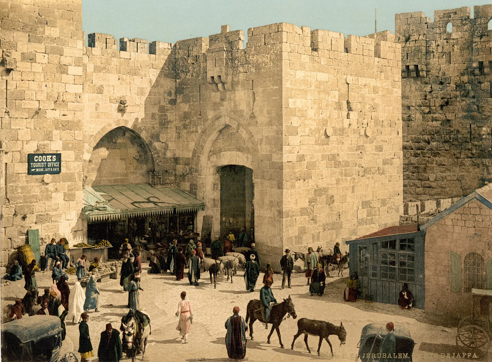
On the Jaffa Gate plate, a sign is still legible on the city wall, painted in English across two lines: "COOKS TOURIST OFFICE — INSIDE JAFFA GATE." It tells you on its own where that travel office stood, and who these images were made for — a European or North American buyer, someone who had either never made the trip or wanted to carry home what he'd seen. We tell this city's story at greater length in our piece on Jerusalem around 1900.
A night assembled in the workshop
Night is the case that shows most clearly what the process does, because it pushes the same logic to its limit. The negative keeps no colour — true of every plate in this collection, this one included — which means that what we call "a night" was never recorded as such by the camera at all. It's a tint chosen in the workshop, laid over a negative that, by its very nature, could say nothing about what hour it was.
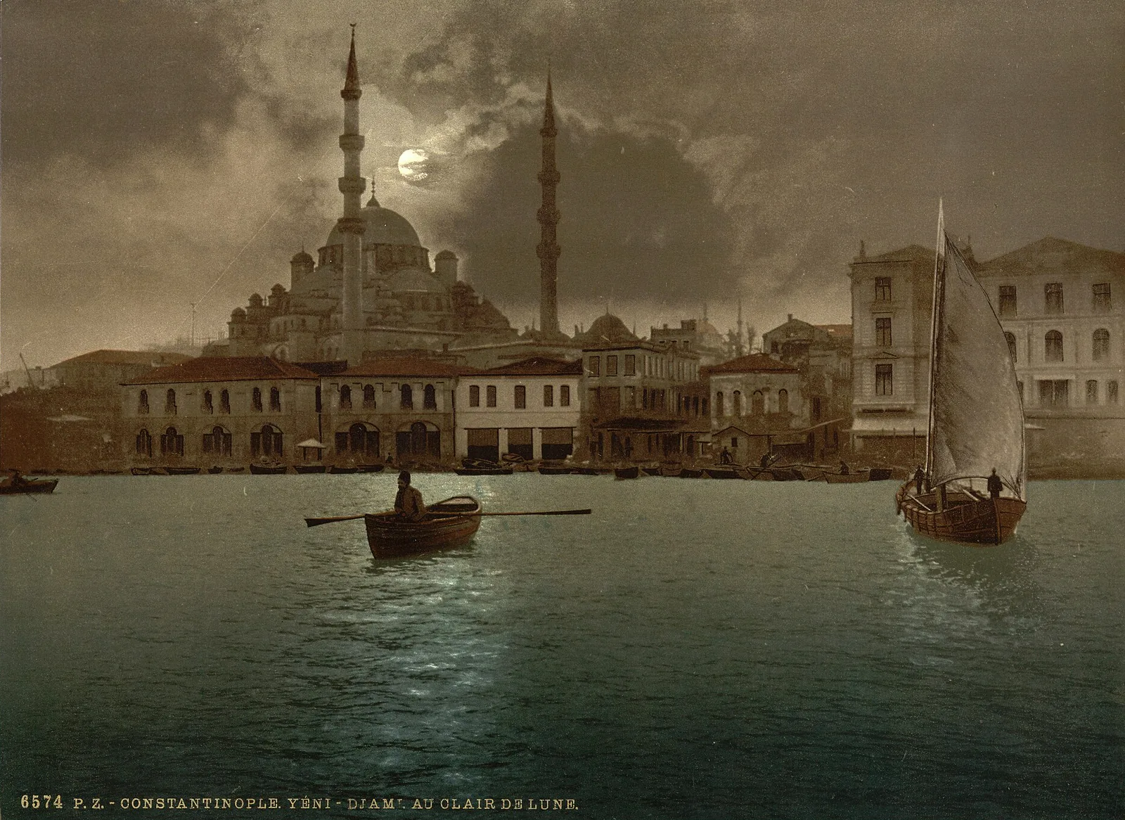
The plate carries its own caption, printed at the bottom: "Constantinople. Yéni-Djami au clair de lune," numbered 6574. A moon shows faintly through a clouded sky, the harbour water deepens to blue-green, its light laid across the surface in a pale trail — and yet the rigging of the sailboat in the foreground, the hull of the rowboat, and the rower himself stay crisp in a way no genuine night exposure of the period could have managed. What the plate shows isn't a photographed night. It's a night that was decided, and laid over a day.
Recognizing a photochrom
Three things together give the process away. A sharpness that neither the brush nor the pencil of a hand colourist can reach — hand-colouring works the surface, in watercolour or oil, over a photograph already printed. A serial number. And a caption printed in capitals along the bottom edge. On our four plates, those captions still read: "6936. P.Z. — Paris. Vue panoramique des Sept Ponts," "6266. P.Z. — Kairouan. Une rue," "6574. P.Z. — Constantinople. Yéni-Djami au clair de lune" — the Jaffa Gate plate carries one too, but the donkeys' legs in the foreground cover its number. A hand-coloured photograph carries neither.
The format is a giveaway too: most photochrom prints of this generation share the same sheet, roughly 16 × 23 cm, whatever the subject. And the subject itself barely changes from one workshop to the next — landscapes, architecture, street scenes, daily life staged for people who don't live it. This isn't a neutral inventory of the world. It's a catalogue of views built for travellers from the outset.
It's worth separating the photochrom from a later process it's often confused with: the Lumière brothers' Autochrome, patented in 1903 and sold commercially from 1907, which genuinely captured colour at the moment of exposure, through a mosaic of dyed starch grains pressed onto a glass plate. The photochrom predates the autochrome by about twenty years, and it never captures colour at all — it invents it, afterward, out of a black-and-white base.
What the print gives back
Knowing this changes what ends up on the wall.
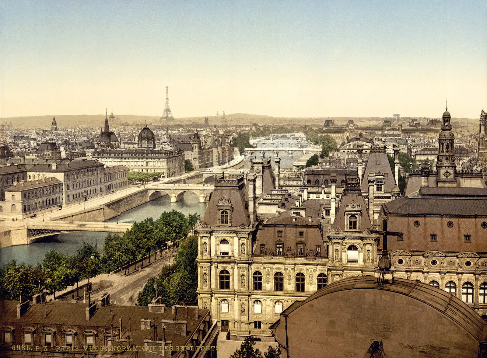
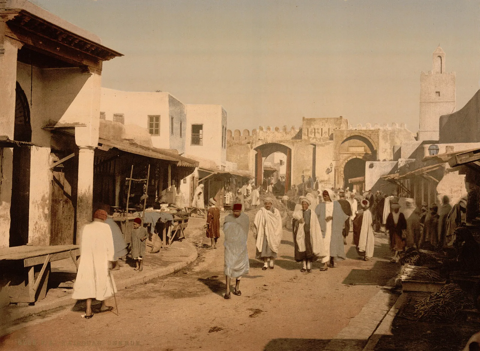
A plate like the Seven Bridges, looking down on the Seine with the Eiffel Tower on the horizon, or the Souk in Kairouan, its crowd in white under a pale sky near a gate of the medina, isn't documenting an exact colour. It's documenting a way of seeing — a Zurich workshop's, one that never set foot on the Seine or in Kairouan. That's what the print restores: the sharpness of a negative more than a century old, and a colour choice that still says something about who was looking at whom.
Sources
- Photochrom - Wikipedia (English)
- About this Collection | Photochrom Prints | Digital Collections | Library of Congress
- About this Collection | Detroit Publishing Company | Digital Collections | Library of Congress
- Hand-colouring of photographs - Wikipedia (English)
- Autochrome Lumière - Wikipedia (English)
- The heyday of photochrome images | Swiss National Museum Blog